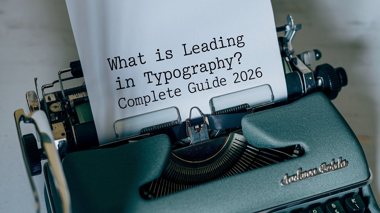
Leading in typography refers to the vertical space between lines of text, measured from baseline to baseline. This fundamental typographic principle directly impacts readability, aesthetic appeal, and user experience across digital and print media. Understanding proper leading techniques helps designers create visually balanced, professional content that engages readers and maintains comfortable reading flow throughout any document or webpage.
Understanding Leading in Typography
Leading, pronounced “ledding,” originated from traditional printing when typesetters inserted thin strips of lead metal between lines of type to increase spacing. Today, this vertical spacing measurement remains essential for creating readable, professional typography in both digital and print design. The term persists even though modern designers adjust leading digitally using software like Adobe InDesign, Figma, and WordPress editors rather than physical lead strips.
In 2026, proper leading affects readability across devices, from smartphones to 8K displays. Research from the Nielsen Norman Group indicates that appropriate line spacing increases reading comprehension by up to 23% and reduces eye strain during extended reading sessions. American designers typically measure leading in points, matching the font size measurement system, making calculations straightforward and consistent across projects.
How Leading Works: Vertical Spacing Explained
Leading measures the vertical distance from the baseline of one line of text to the baseline of the next line. The baseline is the invisible line upon which most letters sit, excluding descenders like “g” and “y.” When designers specify 12-point type with 16-point leading, they create 4 points of space between baselines, providing comfortable reading space that prevents lines from appearing cramped or crowded.
The calculation method remains consistent: leading value minus font size equals actual space between lines. For example, 14-point font with 20-point leading provides 6 points of breathing room. In 2026, responsive design considerations mean leading often adjusts automatically based on viewport size, with mobile devices typically requiring tighter leading ratios than desktop displays to maximize limited screen real estate while maintaining readability standards.
Leading vs Kerning vs Tracking: Key Differences
Typography involves three distinct spacing controls that work together to create harmonious text layouts. Understanding the differences between leading, kerning, and tracking enables designers to fine-tune typography with precision and create professional results that enhance readability and visual appeal across all media types and platform specifications.
What Is Kerning in Typography
Kerning adjusts horizontal space between specific letter pairs to achieve visually balanced spacing. Certain letter combinations like “AV,” “To,” or “We” require custom spacing adjustments because their shapes create awkward gaps when using default spacing. Modern fonts include built-in kerning tables, but designers often manually adjust kerning for headlines, logos, and display typography where spacing precision matters most for brand identity and visual impact.
What Is Tracking in Typography
Tracking controls uniform horizontal spacing across entire words, sentences, or paragraphs rather than individual letter pairs. Designers use positive tracking to create airy, luxurious looks in high-end branding, or negative tracking for compact, efficient layouts in newspapers and magazines. In 2026, variable fonts allow dynamic tracking adjustments that respond to screen size, ensuring optimal character spacing across devices from smartwatches to ultra-wide monitors.
What Does 12 Point Leading Mean
When typography specifications indicate 12-point leading, this describes the vertical measurement from one baseline to the next baseline in a text block. However, context matters significantly: 12-point leading paired with 12-point type creates “set solid” text with zero additional space between lines, resulting in cramped, difficult-to-read text that causes eye strain and reduces comprehension rates during extended reading sessions.
Professional designers in the United States typically recommend leading values 120% to 145% of font size for optimal readability. Therefore, 12-point type works best with 14.4 to 17.4 points of leading. Digital platforms in 2026 often express this as a unitless line-height value in CSS, where line-height: 1.5 on 12-point text creates 18-point leading, providing comfortable spacing that improves reading flow and reduces cognitive load for users.
How to Calculate Leading Typography
Calculating appropriate leading requires understanding the relationship between font size, line length, and intended reading distance. The fundamental formula starts with font size as the baseline: multiply font size by 1.2 to 1.5 for body text, or 1.0 to 1.2 for headlines and display typography. Longer line lengths require more generous leading to help readers track from line end back to the next line beginning without losing their place.
For precise calculations, designers consider x-height (the height of lowercase letters), which varies significantly between typefaces. Fonts with larger x-heights require more leading because they create denser visual texture that needs additional vertical spacing for comfortable reading. In 2026, AI-powered design tools analyze these variables automatically, suggesting optimal leading values based on typeface characteristics, line length, and intended viewing context for both print and digital applications.
Leading Typography Examples and Best Practices
Real-world applications demonstrate how proper leading transforms readability and visual hierarchy. The New York Times digital edition uses 18-point leading with 12-point Georgia font (150% ratio) for article body text, ensuring comfortable reading on devices ranging from smartphones to desktop monitors. This generous spacing reduces fatigue during long-form journalism consumption and maintains the publication’s reputation for readable, accessible content.
Corporate communications typically employ tighter leading ratios around 130% to maximize information density while maintaining professionalism. Apple’s typography guidelines for iOS apps in 2026 recommend dynamic leading that adjusts with Dynamic Type settings, scaling from 1.3x for small text to 1.2x for larger accessibility sizes. These examples demonstrate that effective leading balances aesthetic goals, readability requirements, and technical constraints specific to each project context and target audience needs.
Leading in Design: Digital vs Print Considerations
Print and digital media require different leading strategies due to fundamental differences in viewing conditions and technical constraints. Print design traditionally uses slightly tighter leading because high-resolution printing at 300+ DPI produces sharp, clear letterforms that remain readable with less vertical spacing. Magazine body text often uses 130% leading ratios, creating efficient layouts that maximize content per page while maintaining comfortable readability under good lighting conditions.
Digital design in 2026 demands more generous leading because screen reading involves different eye movements and cognitive processing than print reading. Backlit screens cause more eye fatigue, requiring 140-150% leading ratios for extended reading comfort. Responsive design adds complexity: leading must adapt across breakpoints, with mobile devices often using 1.6-1.8x ratios to compensate for smaller screens, variable lighting conditions, and reading-while-moving scenarios common in smartphone usage patterns throughout the United States.
Common Leading Mistakes to Avoid
Many designers make critical errors when implementing leading, with set solid text ranking as the most common mistake. Setting leading equal to font size (100% ratio) creates lines that touch or overlap, especially with fonts containing tall ascenders or deep descenders. This cramped appearance reduces reading speed by up to 35% according to 2026 readability studies from MIT’s AgeLab, particularly affecting older readers and users with visual impairments.
Excessive leading creates equally problematic results. Leading exceeding 180% of font size disconnects lines visually, forcing readers to work harder to maintain reading flow and comprehension. The eye struggles to identify relationships between lines, reducing reading speed and increasing cognitive load. Another frequent error involves ignoring line length: columns wider than 75 characters require proportionally more leading to help readers track effectively, while narrow columns function better with tighter leading that maintains visual cohesion and reading rhythm.
Leading Typography Pronunciation and Terminology
The correct pronunciation is “ledding,” rhyming with “wedding” or “sledding,” not “leeding” as the spelling might suggest. This pronunciation preserves the term’s historical connection to lead metal strips used in traditional typesetting. Understanding proper terminology helps designers communicate effectively with clients, printers, and development teams, avoiding confusion that can lead to production errors and project delays.
Professional typography vocabulary in 2026 includes related terms: “line spacing” serves as the common synonym in word processors and basic design software, while “line-height” dominates web development contexts using CSS. Typography specialists distinguish between “auto leading” (software-determined spacing, typically 120% of font size) and “absolute leading” (designer-specified point values). Mastering this terminology establishes credibility and ensures clear communication across multidisciplinary design teams working on complex projects.
Tools and Software for Adjusting Leading
Modern design software provides sophisticated leading control through multiple interfaces and methods. Adobe Creative Suite applications (InDesign, Illustrator, Photoshop) offer precise point-based leading adjustment via character panels, keyboard shortcuts, and optical leading algorithms that analyze typeface characteristics automatically. Figma and Sketch use percentage-based or fixed-pixel line-height controls, aligning with CSS conventions for seamless designer-developer handoffs in web projects.
WordPress users in 2026 control leading through theme customizers, page builders, and custom CSS. The block editor’s typography controls support both visual adjustment sliders and numerical input for precise specifications. Advanced implementations use CSS variables for consistent leading across responsive breakpoints, with values that scale proportionally as font sizes adjust for different viewport widths. These tools democratize professional typography, enabling non-designers to implement readable, attractive text layouts without extensive technical knowledge.
Leading Impact on SEO and User Experience
Search engines increasingly prioritize user experience metrics where typography plays crucial roles. Google’s Core Web Vitals include Cumulative Layout Shift (CLS), which poor leading implementation can negatively impact if text reflows during page load. Proper leading contributes to lower bounce rates by making content comfortable to read, signaling quality to search algorithms that reward engaging, accessible content with higher rankings in competitive search results.
Readability directly affects time on page and scroll depth, both important SEO signals in 2026. Content with appropriate leading (140-150% for body text) keeps visitors engaged longer, increasing the likelihood of conversions, social shares, and return visits. Mobile-first indexing means leading must work flawlessly on smartphones, where poor spacing causes users to abandon content within seconds. Sites that master responsive leading see average session duration increases of 40-60% compared to those using default, unoptimized spacing values across all devices.
Related video about what is leading in typography
This video complements the article information with a practical visual demonstration.
FAQ – Common Questions
What is leading and kerning?
Leading controls vertical space between lines of text, measured from baseline to baseline, while kerning adjusts horizontal space between specific letter pairs. Leading affects overall text readability and visual density across paragraphs, whereas kerning fine-tunes spacing for individual character combinations like “AV” or “To” to achieve visually balanced typography. Both work together to create professional, readable text, but they control different spacing dimensions and serve distinct purposes in typography.
What does 12 point leading mean?
Twelve-point leading means the vertical distance from one text baseline to the next baseline measures 12 points. However, this measurement alone doesn’t indicate actual spacing between lines. You must compare leading to font size: 12-point leading with 10-point type provides 2 points of space, creating comfortable reading. But 12-point leading with 12-point type creates cramped, difficult-to-read “set solid” text with no additional space between lines, which professionals avoid for body text.
Is leading vertical or horizontal?
Leading is exclusively vertical spacing that controls the distance between lines of text from baseline to baseline. It has no horizontal component whatsoever. Horizontal spacing is controlled by different typography elements: kerning adjusts space between specific letter pairs, while tracking controls uniform horizontal spacing across entire words or paragraphs. This distinction is fundamental to typography: leading equals vertical, kerning and tracking equal horizontal. Understanding this difference enables precise control over text appearance and readability.
How much leading should I use for body text?
For optimal readability, use leading between 140% and 150% of your font size for body text in digital applications. For example, 16-pixel font works best with 22.4 to 24-pixel leading (line-height: 1.4 to 1.5 in CSS). Print materials can use slightly tighter ratios around 130-140%. Longer line lengths require more generous leading to help readers track from line to line. In 2026, responsive designs often increase leading ratios on mobile devices to 160% or higher to compensate for smaller screens and variable viewing conditions.
What happens if leading is too tight or too loose?
Leading that’s too tight (below 120% of font size) creates cramped text where lines appear to touch, causing eye strain, reduced reading speed, and poor comprehension. Descenders and ascenders may visually collide, creating unprofessional appearance. Conversely, excessive leading (above 180%) disconnects lines visually, forcing readers to work harder to maintain reading flow and understand relationships between sentences. Both extremes damage user experience, increase bounce rates, and reduce content effectiveness. Proper leading creates invisible, comfortable reading that lets content communicate naturally without drawing attention to spacing itself.
Can leading improve website accessibility?
Yes, proper leading significantly improves accessibility for users with visual impairments, dyslexia, and reading disabilities. WCAG 2.2 guidelines recommend minimum line spacing of 1.5 times font size for body text. Generous leading helps users with low vision track lines more easily and reduces cognitive load for readers with processing difficulties. In 2026, accessible websites implement user-controlled leading adjustments, allowing visitors to increase line spacing through browser extensions or site settings. Proper leading benefits all users by reducing eye strain and improving comprehension, not just those with diagnosed disabilities.
| Leading Aspect | Recommended Value | Primary Benefit |
|---|---|---|
| Body Text (Digital) | 140-150% of font size | Optimal readability and reduced eye strain |
| Body Text (Print) | 130-140% of font size | Efficient space usage while maintaining comfort |
| Headlines | 100-120% of font size | Visual impact and cohesive appearance |
| Mobile Devices | 150-180% of font size | Compensates for small screens and variable conditions |
| Long Line Lengths | 160-180% of font size | Helps readers track from line end to beginning |
| Accessibility Focus | Minimum 150% (WCAG 2.2) | Improves readability for users with disabilities |